
The problem
Cupra wanted to explore what its infotainment system could look like in the future, with total creative freedom within what the brand stands for. The challenge was to propose something that felt unmistakably Cupra, without a previous reference from the brand to build on. In parallel, models already in production couldn’t wait for that potential future: they still needed constant UX/UI improvements, so the work moved between two very different paces.
Innovating without straying from the brand
There was no existing proposal from the brand to build on: we had to imagine what its infotainment system could look like in the future, with creative freedom but staying unmistakably Cupra.
The present doesn't stop
While that possible future was being explored, current cars kept needing UX/UI fixes and improvements day to day.
Alongside the visual UI proposals, I worked on the UX side: benchmarking, defining user flows for the different functions, preparing the assets so the development team could build the prototype, and helping prepare and analyze the user test.


The steering wheel as a design constraint, not a detail
The space the steering wheel covers and the shadow it casts on the screen directly shaped where each interface element could go — a physical limitation that simply doesn't exist on a desktop or mobile screen.
Regulation designs too
Certain functions had to appear on the homescreen without exception, by regulation — a constraint that came neither from research not from the user.
Three paths, one verdict
The three UX paths were tested with users to determine which one was the most intuitive. The result pointed to which direction to take, and it also revealed some recurring friction points, such as: in several cases, users weren't sure how to go about editing the widgets — which led to proposing the addition of a shortcut button for editing widgets.
Due to NDA, I can't share screenshots of unpublished work or closed-off result figures. The project stayed at the conceptual proposal stage, without reaching a final implementation. What was delivered was the process up to that point — benchmarking, information architecture, three UX paths, the analysis of the user validation results, and the visual proposals.
In parallel, the outcome of the production project was ongoing rather than a single deliverable: UI improvements that did make it into models already on the road, the result of daily work alongside development teams to solve implementation issues without compromising the user experience.

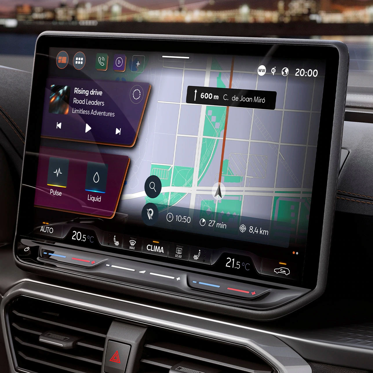


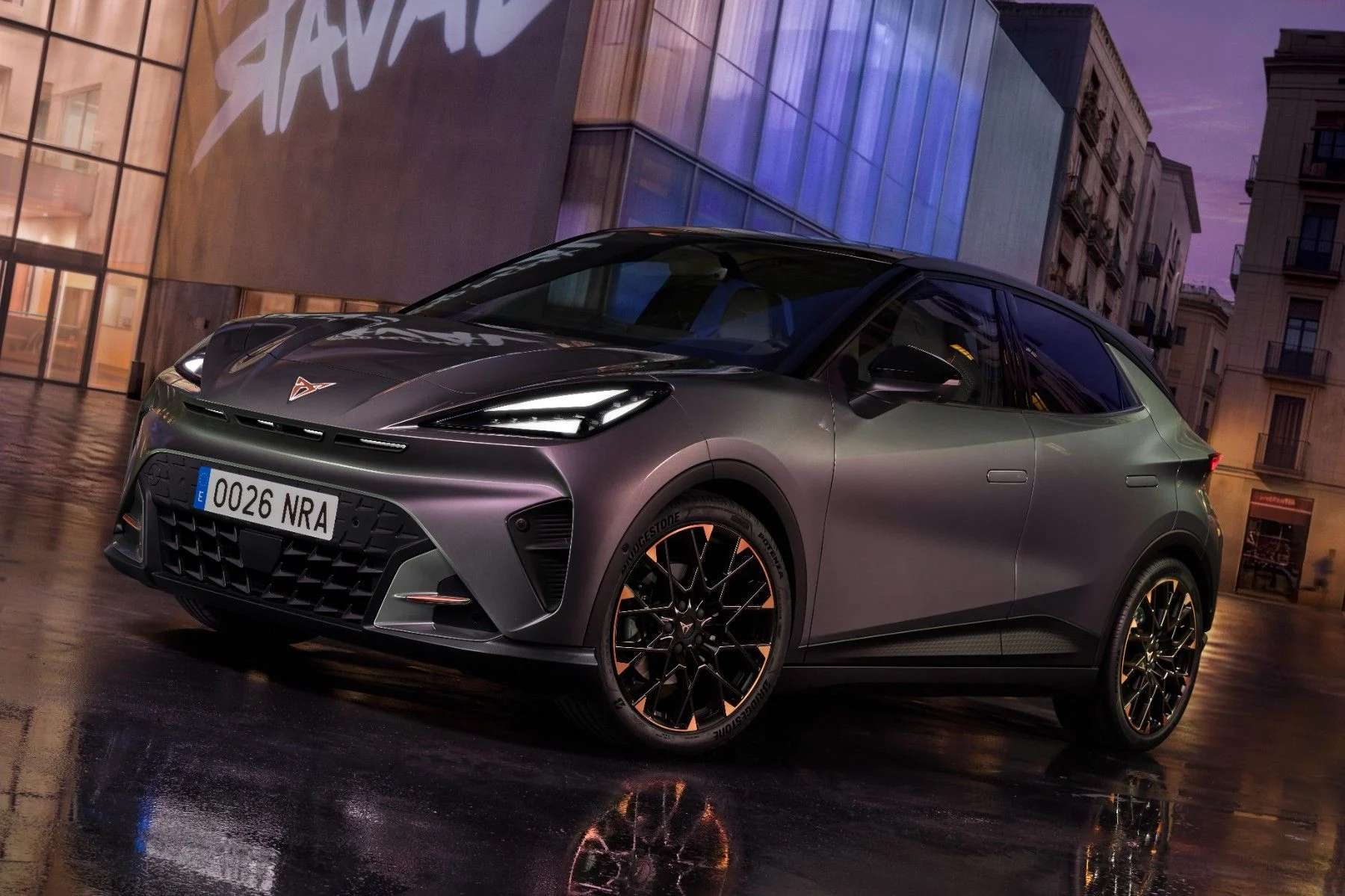

*Official Cupra press images from the production project — not actual screenshots of the design work, which I can't share due to NDA.
Constantly shifting scale
Working in parallel on such different horizons —a future concept that doesn’t exist yet and models that are already on the road— forces you to constantly shift scale, without losing rigor in either one.
Handing off without seeing the end
In an agency, you don't always see a project through to the end: knowing how to hand off a solid, well-documented process that can stand on its own no matter what happens afterward is just as important as the design itself.
Designing motion too
Designing several graphic styles in parallel with the motion team adds an extra layer: the design is no longer just static, you also have to think about how it moves.
Deciding fast, deciding reversibly
Working on the production side trained me to make fast, reversible design decisions, knowing that any change would go through a technical conversation within the following weeks — a very different pace from the conceptual project.